Embracing the return of skeuomorphism – The Zoom Whiteboard Toolbar
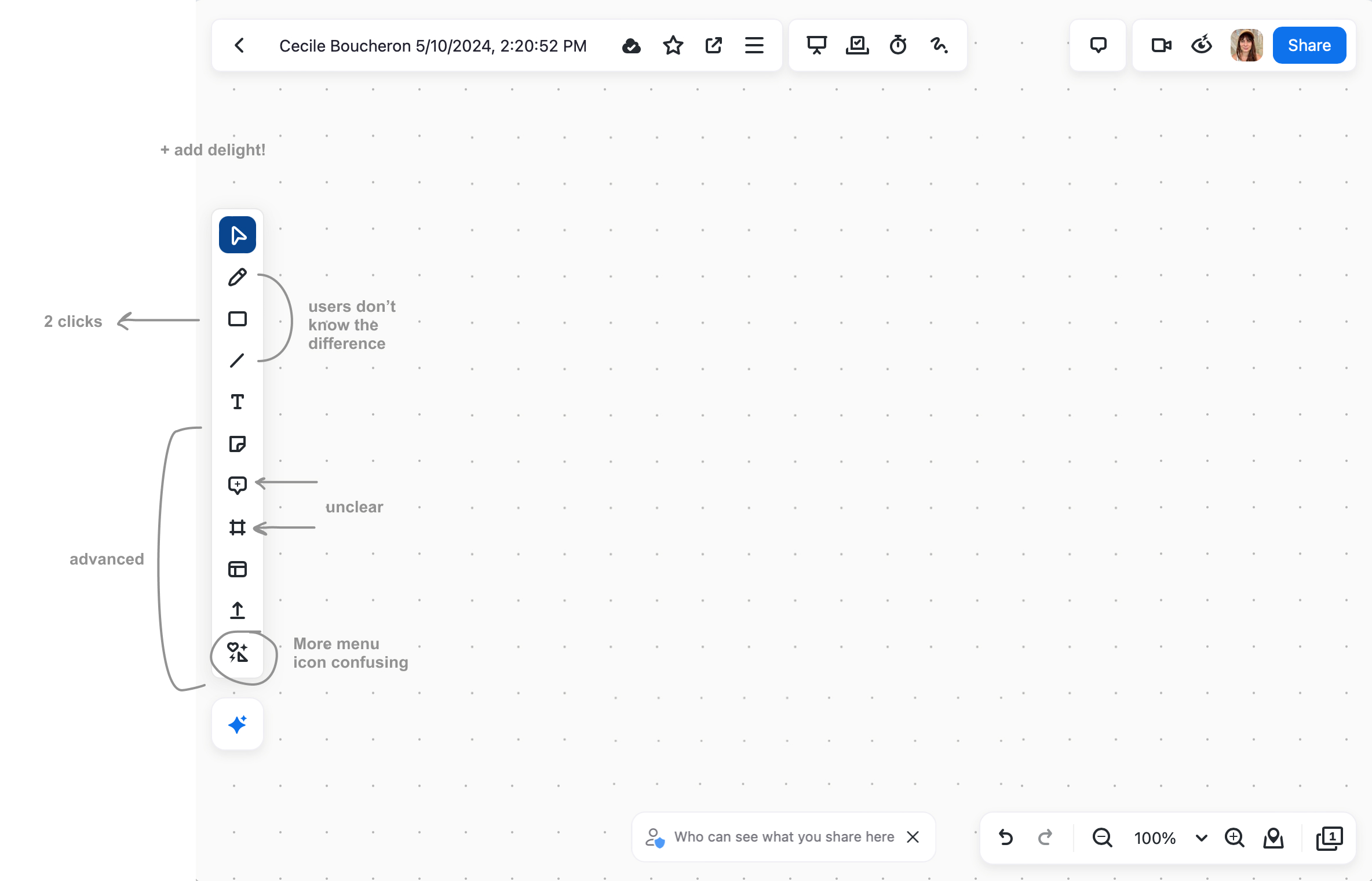
Zoom Whiteboard serves millions of people and competes with Miro, Lucidchart, and FigJam. But the left toolbar felt flat and dated, and users told us some icons were confusing. We needed clearer tools without slowing down existing power users.
Embracing the return of skeuomorphism
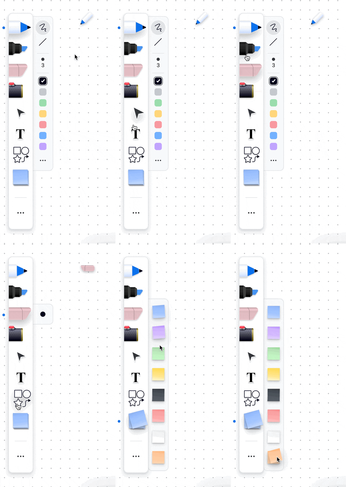
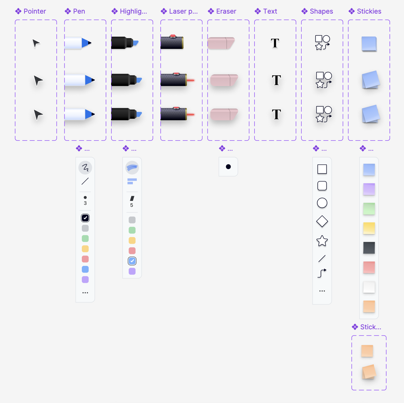
- I redesigned the core tool icons to look like real, tactile ones, and added light micro-interactions for delight.
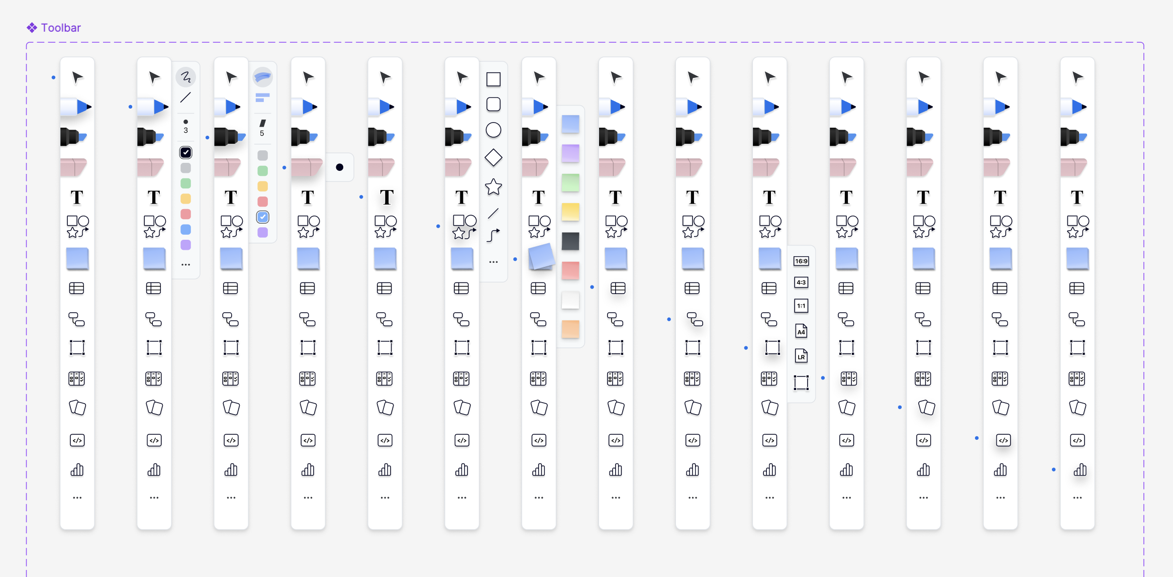
- I simplified the toolbar by moving advanced tools into a More menu.
- I made it personalizable with drag-and-drop so users could keep only what they used most.

But user testing revealed a clear split
New or occasional users recognized the tools faster and felt more confident. The tactile, tool-like icons made the first click easier. Daily users liked the polish but resisted a large visual change that challenged muscle memory and threatened speed and accuracy. Overall, the redesign increased clarity for newcomers while adding friction for experts.
Outcome
Given the size of the user base, the team chose not to ship the redesign as-is. My work de-risked the decision by:
- Making the tradeoff clear: recognition gains for new users vs. friction for long-time users.
- Proposing a safer rollout plan (opt-in, gradual transitions, and migration cues).
- Providing a high-fidelity prototype the team can reuse for future tests and phased launches.
Takeaway: aversion to change is real
Great visuals matter, but habits are strong! We de-prioritized the project to focus on feature launching.
See you later, shiny toolbar.
Try it yourself 👇🏼
- Illustration, Micro-interactions, ui design
- 2024
- New York, NY


